Option types you can add
Optionize includes 21 option types. This article lists each one and when to use it. You pick a type from the Select an option modal when adding an option to an option set.
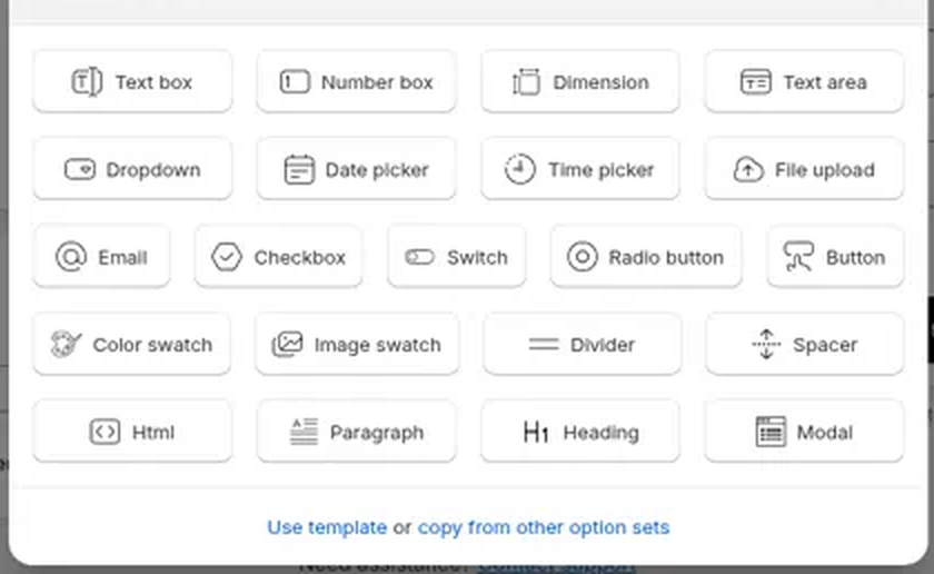
Input options
Customers type or upload something.
| Type | What it does |
|---|---|
| Text box | Single-line text, such as an engraving or a name |
| Number box | Numbers only, with optional min and max values |
| Dimension | Width, height, and/or length, priced by size |
| Text area | Multi-line text, such as a gift message |
| An email address, validated automatically | |
| Date picker | Pick a date, such as a delivery date |
| Time picker | Pick a time |
| File upload | Upload a file, such as a photo or logo for printing |
File upload has its own size limit and resizes images automatically. See Collect file uploads from customers.
Dimension
Use Dimension for made-to-measure products such as curtains, banners, glass, rugs, or crates.
- Choose which measurements the customer enters: Width, Height, and/or Length (at least one).
- Set Customer enters in (mm, cm, m, in, ft, or yd) and Price per (the same unit list). One enabled field is priced by length, two by area (²), three by volume (³).
- Optionally set Min and Max for each enabled field (in the customer unit). Leave them at 0 for no limit.
- Set the rate in Price per m² (the label updates with your field count and price unit). The add-on charged is rate × entered size. (Pro)
Example: 100 × 200 cm at $25 / m² adds $50.00. The product page shows 2 m² (+$50.00), and the cart line item reads Width 100 cm × Height 200 cm.

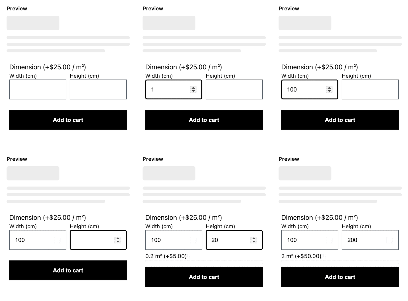
Incomplete or invalid sizes add no price. Validation messages include "Enter all dimensions", "Enter a number greater than 0", and per-field min/max. Those strings, plus Width, Height, and Length, can be translated on the Translations page. See Translate your options widget.
Choice options
Customers pick from values you define. For these types you add option values, one per choice.
| Type | What it does |
|---|---|
| Dropdown | A compact select list, good for long lists of choices |
| Radio button | One choice from a visible list |
| Checkbox | Multiple choices, great for paid extras like gift wrapping |
| Button | Choices shown as a row of buttons, good for sizes |
| Color swatch | Choices shown as color circles |
| Image swatch | Choices shown as image thumbnails |
| Switch | A single on/off toggle with custom on and off labels |
Layout and content options
These don't collect input. Use them to structure and explain your options.
| Type | What it does |
|---|---|
| Heading | A section heading (levels h1 to h6) |
| Paragraph | Formatted text written in a rich-text editor |
| Divider | A horizontal line (solid, dashed, or dotted) |
| Spacer | Vertical empty space, set in pixels |
| Modal | A popup with extra content, such as a size guide |
| Html | A raw HTML block, for advanced custom content |
Tips
- Every option can be marked Required, given a default value, and sized with a width from 25% to 100% so options can sit side by side. (Dimension has no default-value field; mark it Required when the size must be entered.)
- On the Pro plan, values of choice options can carry an add-on price or a linked add-on product. A Dimension option's rate (per length, area with ², or volume with ³ for your Price per unit) uses the same add-on price.
- For everything you can configure per option, see Configure an option's settings.